
7 Creative Ways to Optimize Vertical Space in a Small Retail Store
Commercial rent is constantly increasing, and the physical space you rent is limited. Merchants who can innovate and sell products in a vertical manner, rather than just horizontal expansion, are the ones who get the most out of each inch of space they pay for.
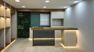
The Golden Zone and What Sits Above It
Merchandise at eye level tends to sell better. This is not a random statement it is the basic concept used to develop any planogram. Your products with highest margin and that sell the fastest should be located in the golden or selling zone, approximately shoulder and eye level are where your clients would look without a second thought. This is where the impulse purchases are located.
Have you ever considered the space above that zone? Most of the time, it is unused, lost space. The upper part of your wall, the space between the top of your furniture and the ceiling could be in fact one of the most valuable branding spaces. This could be used to display big signs, oversized graphics, or even a single statement making your brand pop. This would make the store feel taller, it would be easier for your customers to find what they’re looking for, they wouldn’t have to question where they are nor need help from your employees, or feel lost in a too cluttered space.
Small stores, when successful usually need to exceed $300 per square foot to compete in urban areas (National Retail Federation). Fitting in the golden/selling zone concept will for sure help you get there, it is after all one of the easiest ways to increase productivity.
Modular Wall Systems That Flex With Your Inventory
Switching seasonal product lines in a small space can be pure agony when all your displays are fixed. You need easy, affordable flexibility that doesn’t require tools or a permit.
Gridwall panels offer the most effective, DIY-friendly path to an assortment of layouts and designs. You can easily reconfigure an attractive wire grid panel wall display by simply replacing or repositioning hooks, baskets, and shelves. No tools and no outside help required.
For simple reconfiguration at a good price, wire grid panels themselves make an excellent wall-mounted choice. Different accessories are a snap to install. Feet and casters and mountable hang rails mean you can put your grid wherever you need it – and with no fuss. If you need a cleaner, less cluttered look, simply reduce the number of accessories. The freedom and adaptability of a grid panel wall system will give you a new look in minutes.
Capturing Z-Space Without Adding Floor Footprint
Using less floor space is important for a small store. The more floor space your fixture uses, the less space the customer has to stand in.
The solution for this is z-space. Z-space is the depth you build in a vertical plane by using cascading and tiered hardware. Waterfall hooks, for example, can display six or eight items on a single arm anchored into the wall which reads as depth without pushing any fixture further into the aisle. Face-out merchandising on a vertical panel works the same way: customers see the front of the product clearly, the display is shallow, and you are moving more SKU per linear foot of wall than you would ever be able to on a table or rack.
You also get a much better turn on inventory. When density is high and the product is unobstructed, your customer consistently engages, which means you’re moving stock. And moving stock this way means a much tighter inventory turn.
Perimeter Walls and the Case For a Clear Center Floor
Maintain an uncluttered central floor. It’s the one differentiating factor between smaller stores that feel small and stores that feel curated. Boutique layouts are successful because they force everything to the edges and give customers room to breathe in the middle.
Floating shelves and full perimeter wall units put in the elbow grease here. You’re not losing capacity by getting product up off the floor, you’re shifting it to wall space that wasn’t doing anything for you before. The floor stays clear, sightlines to the back of the store stay open, and customers can see where they’re walking. A store where you can see the back wall from the entrance feels larger than it is.
This includes making sure you’re ADA compliant too. Keeping aisles clear and making sure products are within reach and easily seeing eye-level isn’t just a legal consideration, it’s good merchandising.
read more : 7 Top Sales Execution Problems For Outside Sales Teams
Turning Dead Corners and Pillars Into Display Hubs
At least one structural pillar or a nook that holds a broom on the floor of every small store is just a waste. That’s a missed sale.
Turn the pillar into a wrap-around vertical and you create a 360-degree show hub. Turn the corner into a vignette. Sure, those aren’t natural traffic areas, but a well-merchandised vertical points eyes to the products and not to the construction. Stick a high-margin category there, accessories, gift, seasonal, and that ‘dead’ space is making you money.
Vertical space doesn’t require a reno. It doesn’t even require a big budget. It requires you to look at your store differently and go from looking at your low-margin floor to your high-margin ceiling. The retailers who do that aren’t just better organized, they’re more profitable per square foot, which is the only metric that counts when your rent isn’t getting any cheaper.